3 things we learned about performance when working with large AGGrids
While building apps in Shareable we deal with data, lots of it. It usually ends up served to our user in a form of a chart, D3 visualization or just a plain old table. In the case of a table that would probably be done with the help of AG Grid library (that we like to embed inside our React code).
AG Grid is a super powerful library and comes with all the features we can possibly need out of the box, and it’s built with performance in mind. You can be sure that it will work fast and smooth in the most basic scenarios. But issues and mistakes can start to come up the more custom code you build up on top of your basic grid.
We’ve built a lot of custom code around our grids, and we made those mistakes while doing that. I want to walk you through the most painful ones today, so that hopefully you don’t have too.
What we’re dealing with
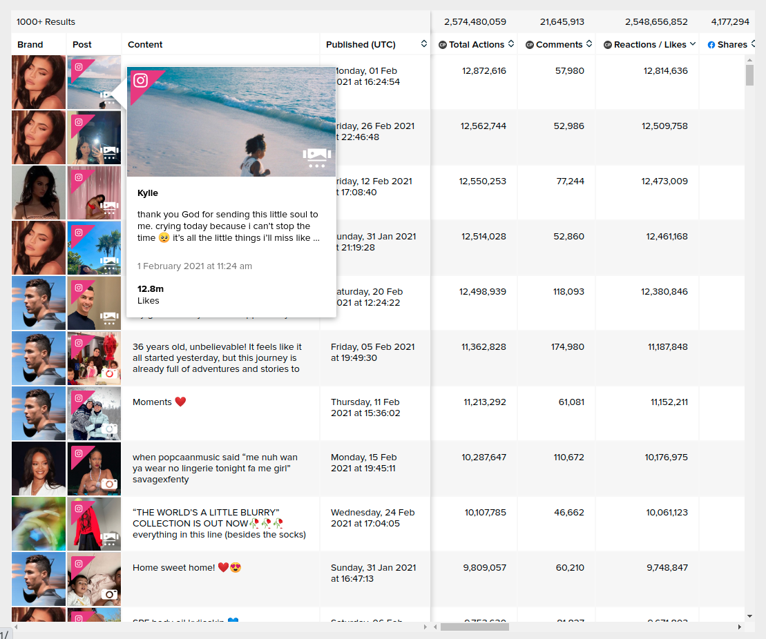
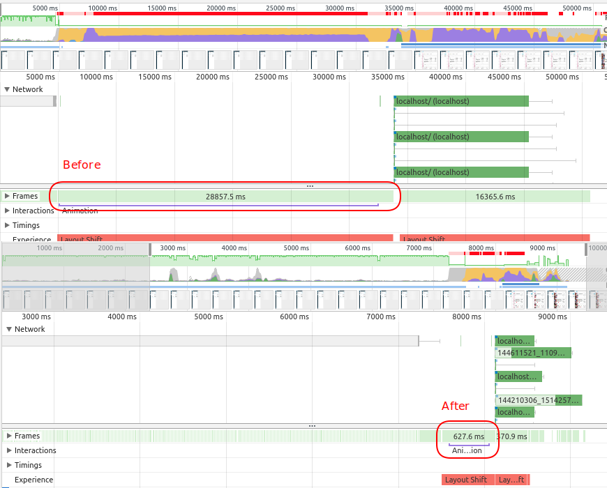
For testing and illustration purposes, I’ll be using a real world component which displays top posts across all social media platforms. By default, it presents 15 metrics, brand logos and miniature posts that include a popup for each row. For testing purposes we’ve loaded it up with 1000 rows using AgGrid 20.1.0. From here we measured how long it took to render the grid with and without the issues mentioned. Everything is measured with the performance profiler in the Developer Tools on Chrome version 88.

Problem 1: Using autoHeight
AG Grid is smart when it comes to rendering the DOM with a feature called row virtualization. It renders only what’s currently on the screen and just a bit more. In our case that means that in the DOM we only have 20 rows (10 that fit on the screen and 10 below that) instead of a 1000.
When autoHeight is enabled then the entire grid is rendered after initial load. That means 1000 rows instead of 20. Which leads to drasticlly faster initial load times. (46 times according to the profiler on our content table). This change means a difference between a smooth, functional interface or serious lag each time the data changes.

I can think of just two reasons why someone would sacrifice performance to use autoHeight. One is a minor delay that occurs when scrolling through the table (the rows need to be added into the DOM and that’s not instantaneous). The effect of that can be reduced by setting rowBuffer property to some higher value. That’s the number of rows that are rendered below a viewport (in our case 10). Even setting that number ridiculously high would still be a performance boost when compared to autoHeight.
The second one would be that the design requires you to do auto height. There might be controls for the grid right above it and then need to scroll together for example. In that case it might be a good idea to talk to your UI designer or just to send them this article.
Problem 2: Using Cell Renderers instead of Value Formatters
Value formatter is a function that takes a value in a cell and turns it into text. Cell renderer is a function that takes a value and turns it into a DOM node. But text can be a node. So why bother with two ways to format value if Cell Renderer can do everything that a value formatter can and much more (for example it can turn brands into their logos like in our example). That’s what we thought when we initially used Cell Renderers in one of our grids to format metrics values.
By this point it should be pretty obvious what’s the tradeoff of using renderer. Replacing metrics Formatters with cell renderers resulted in 20% longer initial load. Of course we still use cell renderers when it’s the valid option (buttons, post previous, images, etc.).
Problem 3: Using React based tooltips instead of CSS ones
When you’re a hammer everything looks like a nail and when you’re a JS developer every problem looks like it can be solved with JS. However, when it comes to showing simple tooltips with just a label then pure CSS solution wins. Not only are those substantially lighter but positioning them at the right spot is much less painful for the developer.
That becomes especially important when we’re embedding them inside grids cells. That way we can easily get to a thousand of them which leads to a lot of unnecessary DOM operations. In our case We have one just one column with text tooltips (brand logos). Replacing JavaScript ones with pure CSS results in almost 50% faster initial render. Unfortunately that won’t always work. For more complicated tooltips and modals we still use React/JS based ones.
Conclusion
When it comes to dealing with large grids it’s easy to make small mistakes that result in tons of unnecessary nodes which tends to correlate with user unhappiness.
If you’re not making any mistakes and still need more speed there is a great article on that in AgGrid docs: https://www.ag-grid.com/documentation/react/scrolling-performance/